 3e986e4057
Resolved conflicts while rebasing after pulling from remote

Exit pipeline if extensions build or tests fail (#1370)

Signed-off-by: Lauri Nevala <lauri.nevala@gmail.com>

Simplify pages/menus/registry extension api internal implementation (#1364)

Signed-off-by: Jari Kolehmainen <jari.kolehmainen@gmail.com>
Co-authored-by: Roman <ixrock@gmail.com>

Resolved conflicts in rebase from master

Updated docs to sentence case throughout

Changed mkdoc.yml nav to sentence case

Signed-off-by: Paul Williams <pawilliams@mirantis.com>

Changed headings to sentence case throughtout docs

Signed-off-by: Paul Williams <pawilliams@mirantis.com>

Changed all titles and headings back to title case throughout docs and in mkdocs.yml nav

Signed-off-by: Paul Williams <pawilliams@mirantis.com>
5.3 KiB
Styling an Extension
Lens provides a set of global styles and UI components that can be used by any extension to preserve look and feel of the application.
Styling Approach
Lens heavily uses SCSS preprocessor with a set of predefined variables and mixins.
For layout tasks Lens is using flex.box library which provides helpful class names to specify some of the flexbox properties. For example, div with class names:
<div className="flex column align-center"></div>
at the end will have following css properties:
div {
  display: flex;
  flex-direction: column;
  align-items: center;
}
However, feel free to use any styling technique or framework like Emotion or just plain CSS if you prefer.
Layout Variables
There is a set of CSS Variables available for extensions to use for basic layout needs. They are located inside :root and are defined in app.scss:
--unit: 8px;
--padding: var(--unit);
--margin: var(--unit);
--border-radius: 3px;
They are intended to set consistent margins and paddings across components, e.g.
.status {
  padding-left: calc(var(--padding) * 2);
  border-radius: var(--border-radius);
}
Themes
Lens is using two built-in themes defined in the themes directory, one for light, and one for dark color schemes.
Theme Variables
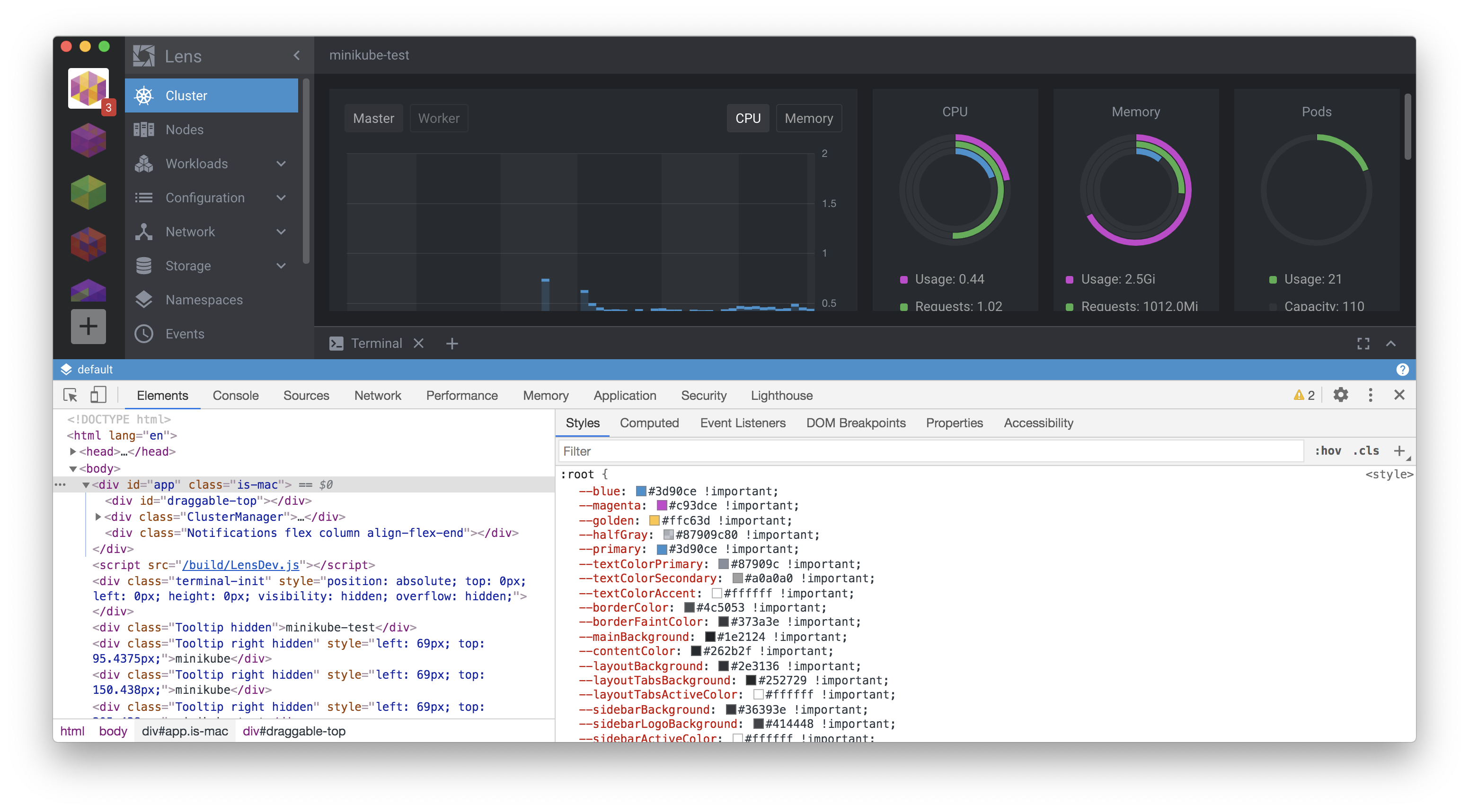
When Lens is loaded, it transforms the selected theme json file into a list of CSS Custom Properties (CSS Variables) which then gets injected into the :root element so any of the down-level components can use them.
When the user changes the theme, the process is repeated, and new CSS Variables appear instead of previous ones.
If you want to follow a selected theme to keep the 'native' Lens look and feel, respecting the light/dark appearance of your extension, you can use the provided variables and built-in Lens components such as Button, Select, Table, etc.
Injected Styles
Every extention is affected by list of default global styles defined in src/renderer/components/app.scss. These are basic browser resets like setting box-sizing property for every element, default text and background colors, default font size, basic headings visualisation etc.
--font-main: 'Roboto', 'Helvetica', 'Arial', sans-serif;
--font-monospace: Lucida Console, Monaco, Consolas, monospace;
--font-size-small: calc(1.5 * var(--unit));
--font-size: calc(1.75 * var(--unit));
--font-size-big: calc(2 * var(--unit));
--font-weight-thin: 300;
--font-weight-normal: 400;
--font-weight-bold: 500;
as well as in the theme modules:
Variables to Use
Basic Styling
There is a list of CSS Variables available for extension to use. Basic variables located inside :root selected in src/renderer/components/app.scss:
--blue: #3d90ce;
--magenta: #c93dce;
--golden: #ffc63d;
--halfGray: #87909c80;
--primary: #3d90ce;
--textColorPrimary: #555555;
--textColorSecondary: #51575d;
--textColorAccent: #333333;
--borderColor: #c9cfd3;
--borderFaintColor: #dfdfdf;
--mainBackground: #f1f1f1;
--contentColor: #ffffff;
--layoutBackground: #e8e8e8;
--layoutTabsBackground: #f8f8f8;
--layoutTabsActiveColor: #333333;
--layoutTabsLineColor: #87909c80;
...
They can be used in form of var(--magenta), e.g.
.status {
  font-size: var(--font-size-small);
  background-color: var(--colorSuccess);
}
Themable Colors
After theme file gets parsed it provides list of theme-defined colors. Most of their values are different for light and dark themes. You can use them to preserve consitent view of extension with respect of selected theme.
  "blue": "#3d90ce",
  "magenta": "#c93dce",
  "golden": "#ffc63d",
  "halfGray": "#87909c80",
  "primary": "#3d90ce",
  "textColorPrimary": "#555555",
  "textColorSecondary": "#51575d",
  "textColorAccent": "#333333",
  "borderColor": "#c9cfd3",
  "borderFaintColor": "#dfdfdf",
  "mainBackground": "#f1f1f1",
  "contentColor": "#ffffff",
  "layoutBackground": "#e8e8e8",
  "layoutTabsBackground": "#f8f8f8",
  "layoutTabsActiveColor": "#333333",
  "layoutTabsLineColor": "#87909c80"
  ...
...
Injected Styles
Every extension is affected by list of default global styles defined in app.scss. These are basic browser resets and element styles like setting the box-sizing property for every element, default text and background colors, default font sizes, basic heading formatting, etc.
Extension may overwrite these if needed. They have low CSS specificity, so overriding them should be fairly easy.
Using CSS Cariables Inside CSS-in-JS components
If a developer uses an Emotion (or similar) framework to work with styles inside an extension, they can use variables in the following form:
const Container = styled.div(() => ({
  backgroundColor: 'var(--mainBackground)'
}));